How to Write Prompts That Produce Photorealistic Images, Not Renders
The difference between a prompt that returns a plastic 3D render and one that returns a believable photograph is structure, not adjectives. A repeatable prompt formula with worked examples.
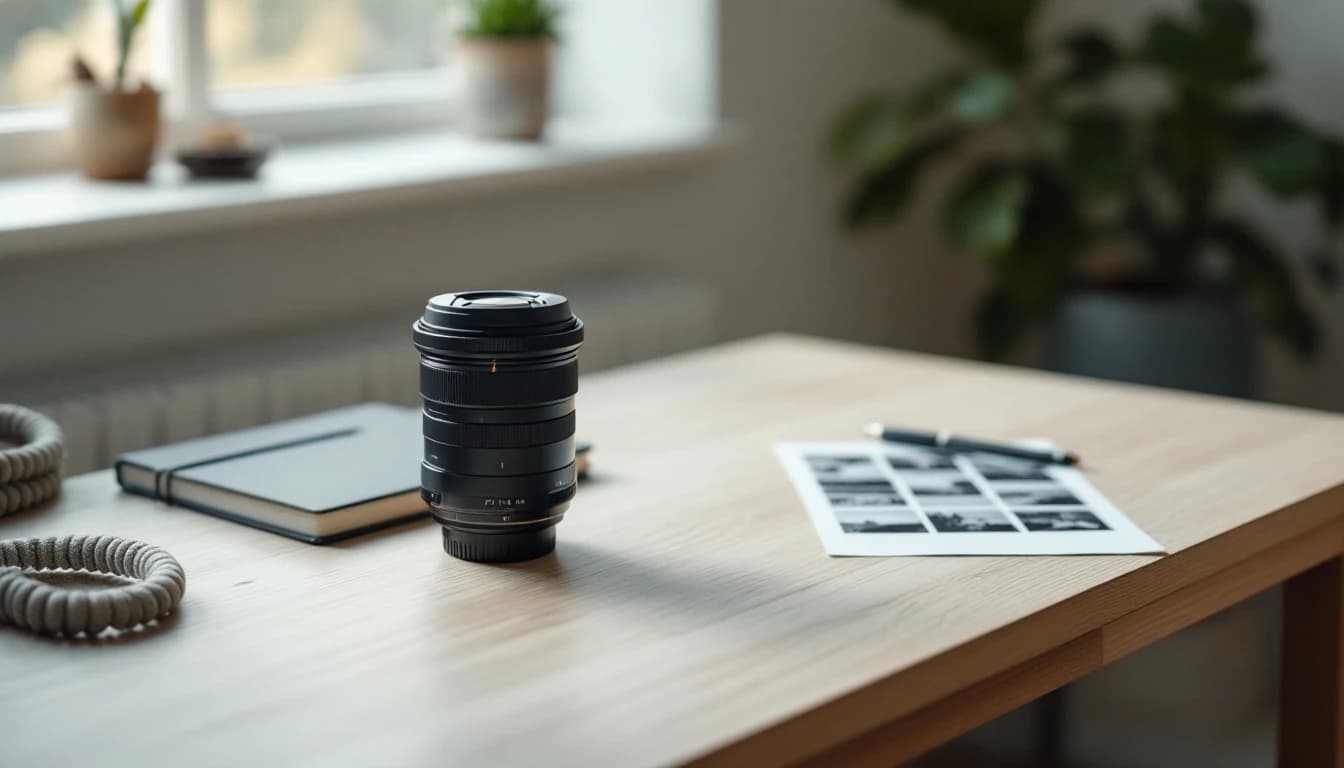
There is a recognisable look to AI imagery used badly: a glossy, weightless quality, colours a shade too saturated, lighting that comes from nowhere in particular, everything in focus at once. People clock it in under a second, and once they do, the page reads as filler.
The interesting part is that this look is not a limitation of the models. It is what you get when a prompt describes what is in the picture and says nothing about how the picture was made. As of July 2026 the fix is entirely on the prompt side, and it is more structural than stylistic.
Why the default output looks synthetic
Image models are trained on enormous quantities of internet imagery, and the internet's visual centre of gravity is commercial: stock photography, product renders, digital illustration, wallpaper. Ask for "a locksmith working on a car door" with no further constraint and the model produces the statistical average of all such images — which is a clean, evenly lit, slightly plastic composite.
A real photograph is the opposite of an average. It was taken with a specific lens at a specific aperture in specific light at a specific moment, and every one of those decisions leaves evidence: shallow depth of field, directional shadows, a colour cast from the light source, motion in something, a frame cropped by physical constraint.
So the job of a photorealism prompt is to specify the constraints a real camera would have imposed. Not to ask for realism as an adjective.
The five-part prompt structure
Everything below is one repeatable order. Cover all five and the output changes noticeably; skip the camera and lighting parts and you are back to renders.
1. Subject and action. Who or what, doing something specific. Actions beat poses — "measuring a key blank against a worn original" is more photographic than "holding a key".
2. Setting and context. Where, with two or three concrete environmental details. Specific beats generic: "a cluttered workbench with a bench vice and coiled cable" over "a workshop".
3. Light. The highest-leverage clause in the whole prompt. Name the source, direction and quality: "hard afternoon sun through a roll-up door, long shadows across the concrete", "diffuse overcast light from a north window", "a single work lamp raking across the surface".
4. Camera. Focal length, aperture, distance, angle. "35mm at f/2, waist height, three-quarter view." This clause does most of the work in pushing output away from illustration.
5. Mood and grade. Two or three words on tone and colour treatment: "muted, documentary, slight warm cast". Restraint matters here — this is where over-specification produces the saturated look you are avoiding.
Put together:
A technician cutting a replacement car key on a bench-mounted key machine, brass shavings on the steel surface, a cluttered workbench behind with a vice and coiled cable, hard late-afternoon sun through an open roll-up door casting long shadows across the concrete, 35mm at f/2 from waist height in three-quarter view, shallow depth of field, muted documentary tone with a slight warm cast, photorealistic editorial photography, no text, no logos, no watermarks.
Compare it with "a professional locksmith cutting a key, ultra realistic, 4K, HDR". Same subject, entirely different output.
What to include and what to drop
The instinct to add quality words is strong and mostly counterproductive. A rough guide:
| Instead of | Use | Why |
|---|---|---|
| ultra-realistic, hyperrealistic | 35mm, f/2, shallow depth of field | Camera specifics produce photographic cues; adjectives do not |
| 4K, 8K, HDR | natural light from a window, overcast | Resolution words map to processed wallpaper aesthetics |
| beautiful lighting | hard side light, long shadows | Direction and quality are what make light read as real |
| professional, high quality | editorial photography, documentary | Names a genre with actual visual conventions |
| in the style of [living artist] | the visual qualities you want | Policy risk, litigation risk, and it is imprecise anyway |
| detailed background | two or three named objects | Models render specifics; "detailed" produces clutter |
| perfect, flawless | slightly worn, used, imperfect | Imperfection is the strongest realism signal available |
That last row deserves emphasis. Real working environments have scuffs, uneven stacks, cables that are not coiled neatly, surfaces with wear. Asking for imperfection is counter-intuitive and works better than almost anything else on the list.
Composing around known weak points
Some subjects remain unreliable. Rather than retrying twenty times, compose so the weakness is out of frame — which is what a working photographer does anyway.
Text. Do not ask for it. Generate a clean plate with negative space and set real type over it in your design tool. You get correct typography, editable copy, and no uncanny lettering.
Hands in close-up. Move them to the middle distance and give them a task. Hands operating a tool at working distance are convincing; hands filling the frame are a coin flip.
Faces. Three-quarter profile, seen from behind, cropped at the shoulders, or softly out of focus behind an in-focus foreground object. All are standard editorial framings and all remove the problem.
Crowds. Groups multiply the failure surface. One or two people, or none at all with evidence of their presence — a half-finished job, tools set down mid-task.
Brand-identifiable objects. Generic is safer and legally cleaner. See our post on commercial use and copyright for why generated logos and likenesses are a category to avoid entirely.
Consistency across a set
A batch of images that each look good individually can still look wrong together, because they read as eight different photographers. The fix is mechanical.
Write the style block once — camera, lens, light quality, palette, grade — and treat it as immutable. Vary only the subject and setting clauses. Resist the urge to "improve" the shared block partway through a set, because that is precisely what breaks the visual through-line.
STYLE (unchanged across the set):
35mm at f/2, waist height, shallow depth of field, diffuse overcast
daylight, muted palette with a slight warm cast, documentary editorial
photography, photorealistic, no text, no logos, no watermarks

SUBJECT (varies):
1. A technician programming a key fob with a diagnostic tablet in a car footwell
2. A row of uncut key blanks in a shallow tray on a workbench
3. A hand steadying a door panel while a trim tool releases a clip
This is also the moment to decide filenames and alt text, because the prompt already contains the description. Which brings up the part most workflows get backwards.
Iterating without starting over
The expensive habit is rewriting the whole prompt when one thing is wrong. Because the five clauses map to distinct visual properties, you can usually diagnose which clause is at fault and change only that.
| What's wrong with the output | Which clause to change | Concrete edit |
|---|---|---|
| Looks like a render or illustration | Camera | Add focal length and aperture; add "editorial photography" |
| Flat, weightless lighting | Light | Name a source and direction; add shadow behaviour |
| Too clean, showroom-like | Mood | Add "used", "slightly worn", "working environment" |
| Wrong subject emphasis | Subject | Move the key noun earlier; cut competing detail |
| Over-saturated, wallpaper-ish | Mood | Remove quality adjectives; add "muted", "natural colour" |
| Background is generic mush | Setting | Name two or three specific objects instead of "detailed" |
| Everything in focus at once | Camera | Widen the aperture; add "shallow depth of field" |
| Composition too centred and static | Camera | Specify angle and height: "low angle", "three-quarter view" |
Change one clause per attempt. Changing three at once means you learn nothing about which mattered, and prompt-writing skill is entirely a matter of building that cause-and-effect intuition for the tool you use.
One caveat: how much of this transfers depends on the model. Prompt behaviour differs meaningfully between generators, and our comparison of AI image generators for SEO covers where each one sits.
Two further habits save time. Keep the prompts that worked — a short library of five or six proven style blocks is worth more than any tips article, because they are calibrated to the generator you actually use and the look your brand actually wants. And stop at good enough: past three or four attempts on the same brief, you are usually fighting the model's interpretation rather than refining a prompt, and rewriting the subject clause from scratch beats a fifth variation.
Negative instructions and what they can do
Most generators respond to exclusions inside the prompt even without a dedicated negative field, and three are worth appending to essentially everything: no text, no logos, no watermarks.
Those three cover the failure modes that make an image unusable rather than merely imperfect. Generated lettering is almost always subtly wrong, invented logos carry trademark risk, and a hallucinated watermark makes an image look stolen when it is not.
Beyond those three, exclusions are less reliable than positive description. Asking for "no clutter" tends to work less well than asking for "an empty workbench with a single tool". Say what should be there rather than what should not — the positive form gives the model something to render.
Prompt specificity is a metadata advantage
Nobody crawling your site reads your prompt. But a vague prompt produces an image you then cannot describe precisely — and honest, specific alt text is one of the few image-SEO items Google's documentation names directly.
If your prompt said "a locksmith working", your alt text will say roughly that, and it will be weak. If the prompt named the action, the tool and the setting, the alt text writes itself and the filename does too. The alt text guide covers what belongs in the attribute; the filename post covers turning a description into a URL-safe name.
The connection is why SEOpix derives the filename, alt text and EXIF block from the generation itself rather than asking you to describe the image afterwards from memory. The description exists at the moment of creation, when it is accurate — and for teams producing images at volume, the bulk workflow is where that saving compounds.
Try the five-part structure on your next three images and keep the style block identical across them. The difference between that and a bag of quality adjectives is not subtle. Ten images a month are free to test it, and the pricing page has the volume tiers.
Frequently asked questions
Why do my AI images look like 3D renders instead of photos?+
Usually because the prompt describes a subject without describing a camera. Generators default toward the visual centre of gravity of their training data, which for an undescribed scene skews toward polished commercial illustration. Naming a lens, an aperture, a light source and a time of day pushes the output toward photographic conventions and away from that default.
Does adding words like 4K, HDR and ultra-realistic help?+
Rarely, and often they hurt. Those terms are strongly associated with heavily processed stock and wallpaper imagery, so they can push output toward exactly the over-saturated look you were trying to escape. Concrete photographic detail — 35mm, f/2, overcast window light — outperforms quality adjectives consistently.
How long should an image prompt be?+
Long enough to cover subject, setting, light, camera and mood, which is typically 40 to 80 words. Beyond roughly 100 words, additional instructions start competing with each other and specific details get dropped. If a prompt keeps growing because the output is wrong, the problem is usually a contradiction inside it rather than insufficient length.
How do I get consistent-looking images across a set?+
Write one style block — camera, lens, lighting, palette, grade — and hold it byte-for-byte identical across every prompt in the set, varying only the subject clause. Consistency comes from not editing the shared portion. This is also what makes a batch of images look like it came from one photographer rather than eight.
Should I include text or logos in generated images?+
No. Text rendering remains unreliable across generators, and generated logos create trademark exposure while looking subtly wrong to anyone familiar with the brand. Generate a clean plate and overlay real text and real logos in your design tool, where you control the typography and the file is editable later.
How do I stop generated hands and faces looking wrong?+
Frame around them. Hands at work in the middle distance, subjects seen from behind or in three-quarter profile, faces out of frame or softly out of focus — all read as natural editorial choices and remove the failure modes. Fighting for a perfect close-up of hands is usually more expensive in retries than composing around the problem.
Does the prompt affect the image's SEO at all?+
Not directly — crawlers never see it. It matters indirectly, because a specific prompt tells you exactly what is in the frame, which is what a descriptive filename and honest alt text need to say. A vague prompt produces an image you then struggle to describe accurately, and inaccurate alt text is worse than late alt text.
Let SEOpix handle the metadata
Filenames, alt text, EXIF fields and GPS coordinates written automatically as each image is generated. Start with 10 free images a month — no credit card required.